So I had this weird idea for a Hellboy Christmas story in that haze between sleep and wakefulness, the nuances of which were almost all fully formed when it came to me, the plot of which was fairly simple: Father Christmas enlists Hellboy's expertise as fighter of the forces of evil to help rescue children from Krampus, the germanic Yuletide demon, and save Christmas in the process.
boom.
I'm about halfway through a draft right now, and though I know I will never get around to illustrating it before this Christmas comes, it's the sort of thing that might make a cool Christmas 'card' next year.
At any rate, this is just a link dump of the research sites in the tabs I have open. Submitted for your approval:
St. Nicholas (wikipedia)
Father Christmas (wikipedia)
Krampus (wikipedia)
Noel (wikipedia)
Amulet (....wikipedia...)
Ephesia Grammata (yup...wikipedia...)
Magic (yeah...you guessed it...)
seal of St. Nicholas (google image search)
Medieval Christmas Traditions
Fairy Tale Channel
Who was St. Nicholas?
Also, there's an elf named Tollenbeck, the ghost of a thief indentured to St. Nick, and a few various demonic associates of Krampus.
The only thing that irks me a bit is that it's a Hellboy story and I'm not a professional, which means....this is basically 'fan-fiction.' And that term makes me want to vomit, a little bit. But pairing Hellboy with Santa to go up against Krampus is just a little too perfect, it almost writes itself. A very preliminary google search tells me it hasn't been written yet, so...there ya go.
Anyway, enjoy the links.
Merry Christmas.
-P
Wednesday, December 12, 2012
Friday, November 30, 2012
photoplay
I have been playing with photoshop a lot.
I forgot how fun it is. Definitely a more productive time waster on the computer than Facebook.
here's some things:
 |
| Bucranium color test -- my favorite tool i think is definitely the 'blur' tool. i like the stark look of inks, but i also like the ability to soften them, given the gradated look that the colors have. I played with the background quite a bit before i looked up a photoshop tutorial on how to create textured backgrounds -- the secret? astronomy photos, as it turns out. the new layer in the background i composited from several nebula photographs, changing them with filters as i went along. |
 |
| does anybody remember 'ditto' sheets from elementary school? worksheets made in a "ditto" machine, before photocopiers were prevalent? They were purple-y like carbon copies, because i think they used carbon paper. i tried to recreate a purpley bleed for the inks of the drawing, and then messed around A LOT with background layers and filters and opacity levels, etc. |
its unlikely i'll use these for anything relating to the final draft of 'Asterion'. the drawings they were taken from are clearly unfinished, but it does make me think about how nice a finished drawing would look with the benefit of some photoshop techniques.
it also makes me think about how finished a 'real life' piece should be before you play with its digital copy. i am concerned with preserving the pieces of my process many times -- i rely heavily on photocopying before I add, say, watercolors or markers to anything i've drawn. this, as well as photoshop, make me wonder how a drawing that starts as one thing might end up as several different looking pieces in several different mediums. I haven't had the opportunity to explore that yet, but I like the aspect of the idea that is 'non-committal' to one single way of working...that a piece doesn't have to be painted, or go through photoshop, or even redrawn in ink to be considered finished, or even to look good. Again, it's all about options.
Wednesday, November 21, 2012
Roughs from 'Asterion'; Phi-sop's Phables
I've been trying to do some drawings for 'Asterion' while keeping it playful -- this is kind of the point, right? To mess around with it and then post here. But I usually end up building up every simple project into a bloated, massive, Tolkienian epic, and 'Asterion' is becoming no different in my mind -- I'm starting to think this could be a trilogy. The only thing keeping it from spinning out of control is that I'm actually letting this idea out onto paper, and that is helping immensely.
Also, while I was about to suffer a boring night at work with what would inevitably become a dead phone had I used it in any boredom staving manner (as I normally do while I'm there), I had to ask myself what I would have been doing had I not had a technological distraction. The answer, of course, was that I'd be drawing. So, I took the time to scratch out some sketches in ball point pen -- my preferred medium for most of my life. Just some gestural little jots, and ideas for symbols or repeating patterns that I could include as visual cues and filler for 'Asterion.' It was nice -- it was a reminder of what I used to do before phones, and before internet. A reminder of things I could still do, if only I would just put my phone away, or spent less time on the web.
When I got home, I cracked the ol' sketchbook open (the one with NICE paper, of which I've had a paralyzing fear of drawing on all my life because it was so expensive and, well, nice). The result was a kind of cool drawing, but one that suffered from my use of both India ink and ball point pen. I love the way ball point has a kind of pencilly looking quality. I love the penstrokes. But next to India ink, it clearly isn't a true black; the coppery glimmer was all wrong when mashed up against a real good solid field of black.
But it was enough momentum to keep me drawing, so the next day I decided to bang out a better pencil sketch of the first page of 'Asterion'. I thought it came out pretty well. I am pleased with the attempt at using the Golden Rectangle as panelling, and I like the way the arcs and lines of the panel drawings implicitly and explicitly mimic the Golden Spiral, winding into infinity.
Not satisfied with that achievement for the day, I wanted to make a blog post, too. I thought this first page sketch was something to write home about, and wanted to share the ball point pen sketches I'd done too.
I'd always marveled at the glimpses offered into a professional artist's sketchbook; so clean, tight, tidy. Immaculate, and full of perfect first draft design sense. Not me. My books are a mess. Big cranky strokes of scribbled ink across a figure's face. Sketches so loose as to be barely even representative of anything. Overworked renderings of body parts attached to hollow, neglected figures. It's disappointing. I figured these blokes must cheat -- they must have someone cleaning up their "sketches" and "thumbnails." Or, at the very least, editing the duds out of the picture. Even if they don't, I console myself with this thought. Happening to have access to Photoshop, I figured I'd try this method out for myself, so as to post more impressive sketches, without the blight of my artistic blunders on display.
I got lost, re-learning Photoshop techniques I'd long forgotten, and manipulating my very simple, unfinished sketches into moody, brooding images that, with a little more work, wouldn't look entirely out of place in, say, a panel of a finished page of a comic book I was working on.
I've always been hesitant about relying on technology, especially when it came to drawing. But the quality of these images, developed from some amateur fooling around with photos taken off of a cell phone, makes me second guess my hesitation. I love drawing, and I want to get good at it and be better at it, and I don't want to be a lazy artist. Yet when it comes to not just getting something done in a certain way, but actually getting something done, Photoshop seems to come in handy. I can use help in the getting something done department, and that's what this 'Asterion' project is about: doing something, first of all, as well as developing my own style. That means no rules, and no self-judgement about what I have to do to get to a final 'product'. Opening avenues of medium and technique, so I can find a method that is mine.
So, in a way, this story, which I guess is about the perils of technology, has come full circle, and its point is this: I should be utilizing technology as a tool, and not letting it turn me into one.
 |
| Page 1 layout sketch for 'House of Asterion'. The panelling is modeled on the Golden Rectangle. |
 |
| Detail of the first panel. The figure is Asterion, with his head out of frame. I am trying not to reveal that Asterion is the Minotaur too early on. It is a challenge. |
 |
| Panel 2. This is Asterion, sitting cross legged. The final image for Panel 2 will have his face scribbled out in a 'V' shape, or the shape of a three pointed star. |
 |
| Panels 3 (Vitruvian man), 4 (bull's head), 5 (abstract sun), 6 (crescent moon), and 7 (star). |
 |
| "Bucranium" sketch, ball point and ink. The Bull-head I think will end up looking more mask-like than a living bull's head -- I like the idea of being able to incorporate skull like qualities, decomposing flesh, fur, and bits of wood, stone, or shell applied to the head. |
 |
| A ball point pen version of Asterion with an abstract "three pointed star" head, and the symbol for Taurus as a corona. |
 |
| an aurora of geometric patterns; this is just a quick doodle to get an idea of what shapes and patterns might be useful for working into backgrounds, or decorating borders. |
 |
| Got a little carried away with cleaning up the Bucranium sketch in Photoshop... |
 |
| My favorite. Retains the sketchy ball point qualities underneath a layer containing the same lines manipulated to be grainy, heavy, dark. Sandwiched together, they look good to me. |
Wednesday, November 14, 2012
Too Many Words
When I'm not getting lost down conspiracy theory rabbit holes on the internet (y'know, shadow governments, UFOs, satanic cults, etc, etc) I'm spending most of my time looking at comic book related stuff. Some of those sites are linked in the side bar to the right. I find myself waking up on a late morning and getting lost down these other rabbit holes, on a smartphone, from the comfort of my own bed, easing my pre-caffeinated transition into the waking world.
Today, I found a cool article by Kurt Busiek, a comics writer with whom I am familiar from the two Astro City graphic novels I've yet to return to a friend. I liked those books pretty well, and the guy's been in the business for awhile - and I know he worked on some Miracle Man stories in some capacity, so I'm inclined to give ear to what he's offering by way of advice about breaking into comics in this article.
It's a pretty interesting (but also rather verbose) story about how Busiek broke into the field, full of ups and downs, ingenuity, resourcefulness and perseverance -- the kind of story my dad might cite to me when he wants to illustrate that success comes with diligence, particularly in the face of discouragement. The kind of story you vaguely connect with the biography of some magnate of industry who started out as a paper boy during the Great Depression and went on to own the newspaper itself. That sort of thing. At any rate, this was the part that struck me most out of the whole article:
It also brings to mind something else I read somewhere -- a quote from Brian Michael Bendis perhaps? -- about breaking into the industry. Whoever-it-was made the point that, while mainstream comics are hard to break into, even if you xerox your own book and give away all the copies, you are now "in comics." As long as you have some sort of comic project you've created and finished and given to the world, you are "in the industry." It is, in fact, the easiest industry to break into, because that's all it takes. It's difficult to be successful, of course (as Busiek illustrates) but again, the point is that it's the work, the effort that you put into these groundwork jobs that gets you there. All that elbow grease.
Which I naturally suck at. So I need to read things like this to keep me motivated and productive.
Anyway, here are a few rough sketches for 'House of Asterion':
Today, I found a cool article by Kurt Busiek, a comics writer with whom I am familiar from the two Astro City graphic novels I've yet to return to a friend. I liked those books pretty well, and the guy's been in the business for awhile - and I know he worked on some Miracle Man stories in some capacity, so I'm inclined to give ear to what he's offering by way of advice about breaking into comics in this article.
It's a pretty interesting (but also rather verbose) story about how Busiek broke into the field, full of ups and downs, ingenuity, resourcefulness and perseverance -- the kind of story my dad might cite to me when he wants to illustrate that success comes with diligence, particularly in the face of discouragement. The kind of story you vaguely connect with the biography of some magnate of industry who started out as a paper boy during the Great Depression and went on to own the newspaper itself. That sort of thing. At any rate, this was the part that struck me most out of the whole article:
"You don't need a map. You need to figure out what you've got and capitalize on that. Instead of bemoaning the fact that you can't mail in something that a publisher wasn't going to read and wasn't going to buy, try to figure out something else, something that builds off your skills or knowledge or contacts or whatever. If you don't have any way to get at Marvel and DC editors, try to get at someone else. Make comics, not just proposals—even making crappy comics that convince you that you never want to draw another background again in your life will teach you more about telling a story in pictures on paper than a zillion proposals in the slush pile.You are your own business manager. You have to be. If all you can do is write, you have no future, since you will get screwed. Not by malicious editors, since they're as rare a breed as people who broke in because they were somebody's gardener—but by editors who use you to fill your needs without any concern for what's best for you and your career. That's not evil—it's not their job to care about your career, it's their job to care about getting their books done. It's your job to care about your career.So develop the skills. Don't ask others to hand them to you. Analyze the market yourself. Figure out who needs what you can do—not who controls what you want to write, but who has a specific need you can fill, whether it be Power Man fill-ins or one-page humor fillers in a local paper. And if it isn't what you want to do most, too bad. How many people get to start out on their dream assignment—in any field? Do it anyway, and see what you can build on it. A year's worth of single-page weekly comics is enough to fill a 48-page collection, and that's a fine calling card.But don't look at the great gulf of distance between where you are and where you want to be and complain that you can't get there without help. Look for the closest opportunity you can find, finagle or create. And go for it. Then, whether it worked or not, look for the next one. And if it takes you 18 years between deciding you want to be a comics writer and actually making a dependable living at it, well, welcome to the club. That's how long it took me, too."
It also brings to mind something else I read somewhere -- a quote from Brian Michael Bendis perhaps? -- about breaking into the industry. Whoever-it-was made the point that, while mainstream comics are hard to break into, even if you xerox your own book and give away all the copies, you are now "in comics." As long as you have some sort of comic project you've created and finished and given to the world, you are "in the industry." It is, in fact, the easiest industry to break into, because that's all it takes. It's difficult to be successful, of course (as Busiek illustrates) but again, the point is that it's the work, the effort that you put into these groundwork jobs that gets you there. All that elbow grease.
Which I naturally suck at. So I need to read things like this to keep me motivated and productive.
Anyway, here are a few rough sketches for 'House of Asterion':
 |
| A drawing I did years ago, from an old sketchbook; the design was originally for Buarainech, the father of Balor in Celtic Mythology. I liked the drawing and thought it was a good jumping off point for some visual elements I wanted in 'Asterion' |
 |
| Inspired by the 'Buarainech' drawing -- an Asterion design with a more anatomically correct headpiece. |
 |
| A quick rough thumbnail of one of the incarnations that Asterion muses his redeemer might take. The head is obviously the astrological sign for Taurus, the sun elements ('sun face,' corona) refer to traditional association of bulls with sun gods. |
 |
| A rough paneling layout for the first page of 'House of Asterion' -- based on a Golden Spiral design. I like the idea that insinuating the spiral in the layout could naturally draw the eye through the panels. |
The first three sketches are done in ball point pen -- a medium I used to draw in all the time because instead of taking notes in class, I was doodling weird crap, and eventually just got comfortable with Bics. I haven't used them in a long time, but I really like certain pencil-like qualities you can get out of them, and for this project, they may even be appropriate for some of the finished art.
This is part of what I hope to work out for myself with 'Asterion' -- what mediums do I work best in? Are they appropriate for comics? Do they reproduce well enough? Do I like the results? Do they fit the mood, tone, ambience, atmosphere, or what have you, of the characters and the story? How does working in other mediums affect my style? Can I master other mediums and styles as well as I have the ball point pen? Should I even bother trying, or just stick to what works for me?
That last question I realize is bunk; of course I should bother trying, when it comes to expanding my talents, I know that. But for the sake of immediacy and efficiency -- for the sake of buckling down and really cranking out a product, I do need to find a technique and medium that aids me in working quickly, and that provides results with which I am happy.
We'll see, I guess.
Sunday, November 11, 2012
Preliminary Thoughts On 'House of Asterion'
What's 'House of Asterion' anyway?
It's a short story by Argentinian writer Jorge Luis Borges. If you are interested in metaphysics, dreams, time travel, philosophy, labyrinths, religion, mythology, books, secret societies and all around general pulp-y and mysterious things, then you should read Borges. Guys like Umberto Eco and Mark Danielewski owe him unpayable debts.
'House of Asterion' was the first Borges story I'd ever read. I won't spoil it for you, and it's only two pages long, so don't spoil it for yourself by wikipedia-ing it before you read it. The end isn't really a twist, but there's an audible click of recognition once your brain gets there and puts the narrative into place.
I decided to adapt it as a script to give myself some work to do as an artist. I've been having trouble with the art on my 'Forteana' comics concept (a historical fiction/horror/sci-fi line) because I want all of it to look like Mike Mignola's work, and that just isn't how I draw. There are plenty of lessons about inking that I can take away from him, but ultimately I'm beginning to recognize that while emulation informs your own style, it cannot serve as a substitute. So, I'm easing up on the Forteana project for a moment in an attempt to separate myself from the pressure of what those characters and drawings "should" look like, and to give myself something to work on where I have no constraints. To find MY style.
Hence, 'House of Asterion.'
It's short. A little abstract. Not quite "horror," but there's definitely something unsettling about it. It lends itself to some interesting visuals.
It's something I should be able to finish in a reasonable amount of time. I can play with it.
And, in the meantime, hopefully give you all something to look at while I work through the process.
-P
Thursday, November 8, 2012
House of Asterion - Qualifying Statements - Assorted Drawings
The House of Asterion Draft 1 PDF
The above is a link to the first part of an experiment I'm trying.
The experiment is aimed at answering this question: can I "do" comics?
I've always had a measure of drawing talent, and truthfully I haven't worked very hard to cultivate it. In my teenage years it was sort of my identity, but I let my ability languish unattended as I grew into adulthood. I look back now and I consider the majority of that time wasted. People less talented and more driven than I am have gone on to spiffy careers in the arts. So have many of the people more talented than I am, and what really chaps my ass about that is that I have the raw talent to be just as good, and I didn't decide to take it to that level.
At any rate, I'm drawing again, and I have to pick up where I've left off, and lots of things have changed. I'm still good. I'm not great. Definitely not employable, yet. Technology has added a whole new dimension to art that I am hardly familiar with; superheroes and '80s pop-culture touchstones -- the stuff I was weaned on -- are exploding (and being exploited); and the medium of comic books are no laughing matter anymore. I've been moved to pick up my pencil, but I look around and I know that what the world of pop, pulp, and comics has become is rapidly growing out of my reach.
It seems like whatever hope my 8 year old self had for his grown-up counterpart to break into comics is becoming even more of a pipe dream.
But, I figure I owe it to the 8 year old me to give it a shot. I'm 32 now and the kid's as persistent as ever.
So, I'm doing this.
Part portfolio, part documentation, part blog. A comicbook junkyard where I dump sketches, scripts, and ideas; where I whine and pay homage; where I may even post a piece of finished art every once in awhile.
We'll see what happens.
-P
(the following are some low res cameraphone pics of some drawings I've been recently working on, completely unrelated to the above script, and in no particular order.)

a redesign concept I was messing with for the Ultra-Humanite

an unabashed Joker rip-off

a dragon, with sharpies


The Black Fly, a Spider-Man/Batman rip off

Zombie feeding frenzy. this is all pencil.

Nick Cave. An attempt to steal his likeness for a character called "Indrid Cold"


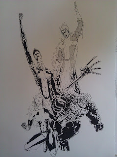
A Fantastic Four redesign attempt

"judy"


Mothman, again.
Subscribe to:
Posts (Atom)